5 Excellent Tips for a Graphic Designer Which Could be Suitable for You
Visual content is more is a powerful medium of communication in graphic design services. Many companies and businesses are relying on it to market and advertise their ventures. It is tough to convince consumers nowadays without visuals since it’s more engaging and memorable than text-based content. Many marketers are running to creative artists who are gifted with the knowledge of turning their ideas into graphic visuals.
For this reason, it’s time for graphic designers to take a refresher course on the fundamentals of excellent graphic designing. There are several ways to approach these and I am going to share with you five great tips on how you are going to improve your designs for greater efficiency. With no further ado, here are 5 Excellent tips for a graphic designer which is suitable for you.
These graphic design tips will help you get back on the right track with your blog, social media, and other forms of visual marketing.

1. Utilize White Space
If you want to know that you are dealing with a beginner, check out how the white space is used. White or negative space attributes to the unmarked spaces in between or around visual elements in a design. You have to strike a balance between effective and misuse of white space. It should be there to make your designs visuals or brand identity pop.
A good example is how Apple has used white space for its HomePod page.
Although it’s extreme, its effectiveness is clearly seen. The emptiness forces the consumer to focus on the product or the company’s identity. Contrary, most amateurs don’t feel comfortable or are not confident enough with white space. Therefore, the end up filling it up with text, images, or other design elements, leaving no place for the eye to rest.
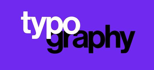
2. Typography Balancing for Readability

Another important element of graphic designing is typography. This refers to the technique of positioning and styling type. Effective typography involves both art and science. As a graphic designer, you need a lot of technical knowledge to master type design. These include the anatomy of letterforms and typestyle classifications. It is hard for a marketer to master all that pertains to typography. Therefore, the best approach is to follow the basic rule of typography, which involves balancing between readability with style.
A font should offer both readability and style. Don’t focus too much on style and forget about readability. Amateurs mostly dwell style, making it hard to read. Since typography’s primary purpose is to communicate, if you are going to highly styled fonts, do it with caution. Don’t make it flat and dull either. You can achieve this by using stylized fonts for large header text while keeping body text more readable with minimal and traditional fonts.
3. Use Color Contrast to Emphasize Attention

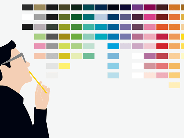
Color is usually intertwined with emotions making it tough even for design experts to get it right. The choice of color will determine the viewer’s perception of the design. So, how do you go about color?
The ideal way to approach color is to use simple high contrast color schemes that are more focused on the elements of design. Besides using color to add visual interest, you should also use it to direct the viewer’s eye to key points of the design.
These include data points, call to action, keywords, or icons. A high contrast color scheme refers to the color found across from each other on the color wheel. They are usually referred to as complementary and split complementary, which are two colors of the highest possible contrast. If you are working on a design project and want to use color to drive the point home, strategically use high contrast color schemes to create visual impact. This allows you to emphasize the most important information.
4. Structure your Text

When you are dealing with text in your designs, it is always advisable to keep it well structured. The structure should be properly aligned throughout the project. Several tools can automatically check whether your texts are aligned. One of them is Adobe, which has built-in tools to maintain consistency throughout without having to go through and manually inspect each element.
All you need to do is apply the header style to each header, and you are sorted. For a block of texts (paragraph), each line should have no more than 30-40 characters, including spaces. Readers may feel overwhelmed by longer texts.
5. Consistency is Key

Consistency should be applied in all design elements including background images, quality, and style. You should also be consistent in your Graphics, diagrams, pictures, framing, form, proportion, illustrations and lighting. Consistency also allows you to have that signature design property that distinguishes your work from others to give you identity. Lack of consistency leaves your visitors and clients to second guess what you are all about, which is not suitable for this industry.
Final thoughts
To create compelling graphic designs, you need to focus on designs that are stunningly beautiful and have all the elements to pass on the message efficiently. When you want to balance your design, use the unmarked areas of the space for a more polished and professional look. On typography, styled headers are the best to capture the reader’s attention.
Don’t over-style your text as you may end up making it unreadable. The trounce way to draw viewers’ attention to key points is to use high contrast colors.
About the author:
Naman Modi is a Professional Blogger, SEO Expert and Guest blogger at NamanModi.com. He is an Award-Winning Freelancer & Web Entrepreneur helping new entrepreneur’s launches their first successful online business.


